ADBE
Case Study
Sunday, 30th of March 2025
Test series were performed to verify the effectiveness of the update
data_joined_cleaned_tbl <- read_rds("01_data/02_wrangled/data_joined_cleaned.rds")
data_joined_cleaned_tbl
#> # A tibble: 2,256 × 3
#> software_version id failure
#> <dbl> <chr> <dbl>
#> 1 1.1 76e899853d32693594596d20837f7fbd681864daff696baacd2… 0
#> 2 1.1 3714cb3b078089ac23bd92ab34c184ae6b69e7389c772e9b639… 0
#> 3 1.1 8601f3d8df88259dd4d0f84a7d0a8b287caf5e08f52b9ca98e4… 0
#> 4 1.2 4b457e08955d94130bf2f90ff905bc76fb1db3942688ff3e228… 0
#> 5 1.1 8dbd0947776dbab34f635daaebabc38309d09f45118da420b30… 0
#> 6 1.2 d7241ff8b59eefc600c21a9f16c12d5045a193f546c22181380… 0
#> 7 1.2 1a42a494855da0ad19f0535740ee4a8d08c6073bdb9aec157af… 0
#> 8 1.1 419c2d6bdc8497b2adc6f1f645689d6094d1f077543448d3af9… 0
#> 9 1.2 8739b5739e334cf30fb624fb970ad575a7475ffbd479ec2aca1… 0
#> 10 1.1 4c76f9572167ccb21c2e0bc93f6be7cf2cd367a116b84baec79… 0
#> # ℹ 2,246 more rows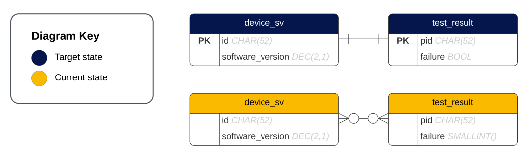
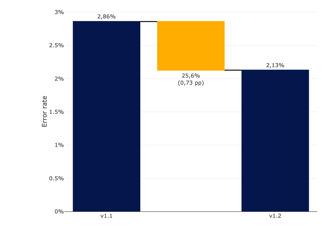
Achieving Precision: 25% Reduction in Mean Error Rates for Waiter Robots
Warning
There is a 95% chance that the confidence interval of [-0,6 pp; 2,1 pp] contains the true difference in the proportion of error rates between the two software versions. In other words, we cannot say with 95% certainty that there is a difference in mean error rates between these versions.
90% Confidence Interval:[-0,4 pp; 1,8 pp]95% Confidence Interval:[-0,6 pp, 2,1 pp]99% Confidence Interval:[-1,0 pp, 2,5 pp]
\(Confidence \: interval = (p_1–p_2) ± z*\sqrt{\frac{p_1(1-p_1)}{n_1} + \frac{p_2(1-p_2)}{n_2}}\)
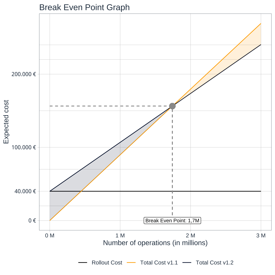
propCI(n1 = 1504, n2 = 752, p1 = 0.02859043, p2 = 0.02127660, alpha = 0.10, digits = 3) |> pluck("result") |> select(CI)propCI(n1 = 1504, n2 = 752, p1 = 0.02859043, p2 = 0.02127660, alpha = 0.05, digits = 3) |> pluck("result") |> select(CI)Crossing the Threshold at 1,7M - Unveiling the Cost Efficiency of the Update
Assumption
The law of large numbers: The average of the results obtained from a large number of independent identical trials should be close to the expected value and tends to become closer to the expected value as more trials are performed.
# Set unitary cost
cost_err_1.1  <- 0.02859043 * 3.14
cost_err_1.2  <- 0.0212766  * 3.14
cost_rout_1.2 <- 40000

# Create units column
units <- seq(from = 0, to = 3000000, by = 100000)

# Create total cost columns
total_cost_1.1 <- cost_err_1.1 * units
total_cost_1.2 <- cost_err_1.2 * units + cost_rout_1.2

# Build data frame
df <- data.frame(units, total_cost_1.1, total_cost_1.2)

# Calculate contribution margin & break even units
contribution_margin  <- cost_err_1.1 - cost_err_1.2
break_even_units     <- cost_rout_1.2 / contribution_margin
break_even_units_chr <- scales::label_number(accuracy  = 0.1,
                                             scale_cut = scales::cut_short_scale(),
big.mark = ".", decimal.mark = ",")(break_even_units)ggplot(data = df, aes(x = units)) +
geom_line(aes(y = cost_rout_1.2,
col = "Rollout Cost")) +
geom_line(aes(y = total_cost_1.1,
col = "Total Cost v1.1")) +
geom_line(aes(y = total_cost_1.2,
col = "Total Cost v1.2")) +
geom_segment(aes(x = break_even_units, xend = break_even_units,
y = 0, yend = break_even_units*cost_err_1.1),
linetype = "dashed", color = "#9B9B9B") +
geom_segment(aes(x = 0, xend = break_even_units,
y = break_even_units*cost_err_1.1, yend = break_even_units*cost_err_1.1),
linetype = "dashed", color = "#9B9B9B") +
geom_point(aes(x = break_even_units,
y = break_even_units*cost_err_1.1),
colour = "#9B9B9B", size = 4) +
annotate("label", x = break_even_units, y = 0, label = paste("Break Even Point:", break_even_units_chr)) +
scale_color_manual(labels = c("Rollout Cost", "Total Cost v1.1", "Total Cost v1.2"),
values = c("Rollout Cost" = "black", "Total Cost v1.1" = "#FFAD00", "Total Cost v1.2" = "#0A1D3D")) +
scale_y_continuous(breaks = c(0, 40000, 100000, 200000),
labels = scales::dollar_format(suffix = " €", prefix = "", big.mark = ".", decimal.mark = ",")) +
scale_x_continuous(labels = scales::unit_format(unit = "M", scale = 1e-6)) +
geom_ribbon(data = df[df$total_cost_1.2 >= df$total_cost_1.1, ], aes(x = units, ymin = total_cost_1.2, ymax = total_cost_1.1), fill = "#0A1D3D", alpha = 0.15) +
geom_ribbon(data = df[df$total_cost_1.2 <= df$total_cost_1.1, ], aes(x = units, ymin = total_cost_1.1, ymax = total_cost_1.2), fill = "#FFAD00", alpha = 0.15) +
labs(title = "Break Even Point Graph",
x = "Number of operations (in millions)",
y = "Expected cost",
color = NULL) +
tidyquant::theme_tq()